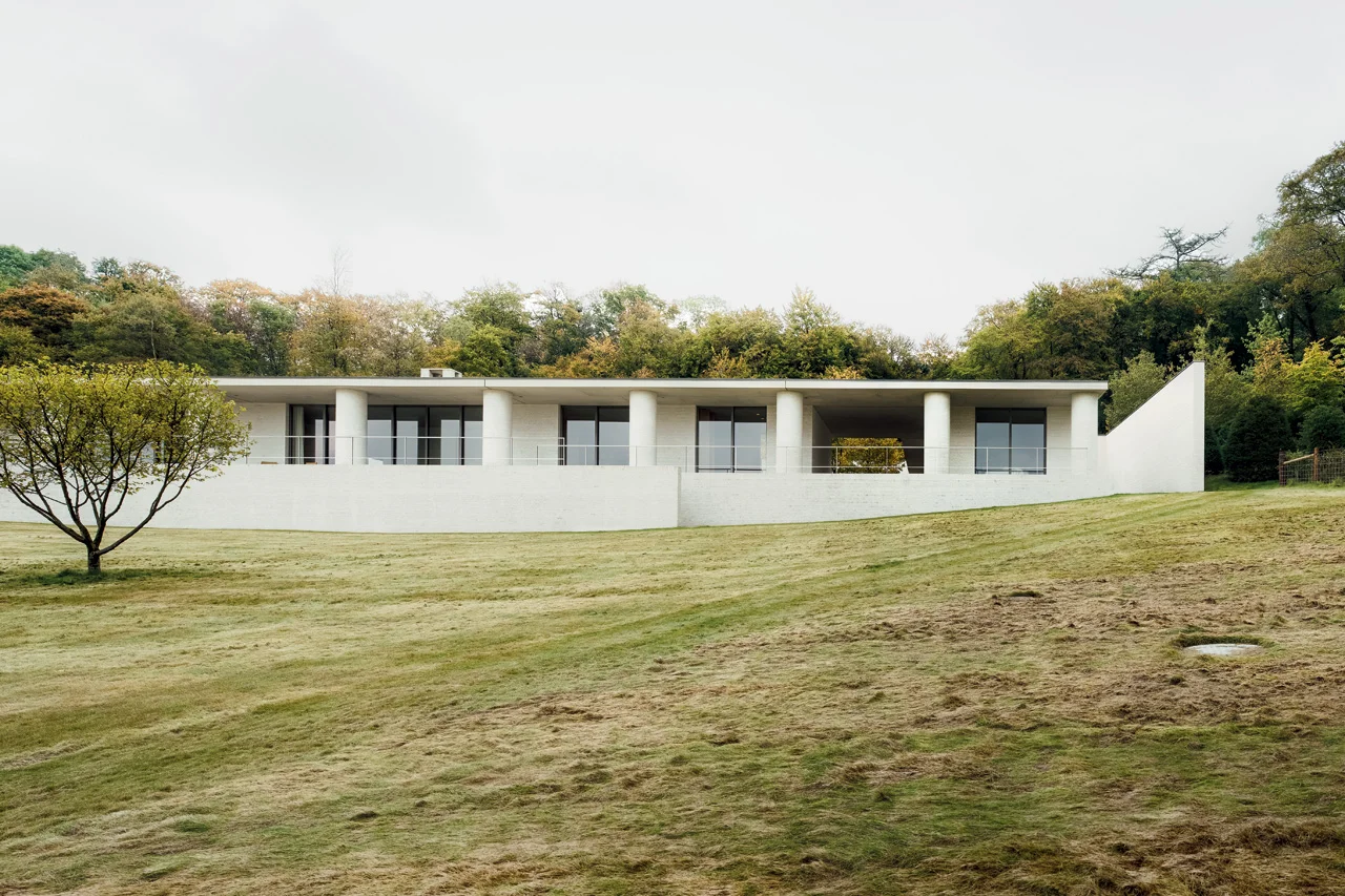
FAYLAND HOUSE

Slung over a sloped field of open ground poised to bloom with wildflowers, David Chipperfield’s Fayland House begins with a concern for context and history. Looking closely, however, the house transcends those qualities in search of a classic timelessness. 

Living spaces languish alongside one another on the front, opening to the view, while ancillary spaces tucked behind rejoice in light from the courtyards. The resulting quiet interplay of interior space and varied landscapes is captured as the camera pans, silently through space in the film. The overlap of view and frame lends a quiet expansiveness to the project. 

But it is the unmodulated run of circular columns along the front of the house which most intrigues us. The chalky, mortar-sponged white-brick is heavy and full and of the earth; with a generosity which extends the house outwards to the sky. Somehow regular and yet surprising, the columns express a classicism which is beyond perception. In an article in Architectural Review, Ellis Woodman perceptively suggested the effect of the columns is similar to the effects cultivated by the work of artist Donald Judd. He concluded his thoughts with a grace so deserved by the building that I cannot help but defer to him here:

The abiding impression is therefore one of invitation to movement. It is a house where one lives on one’s feet and takes pleasure in the constantly shifting relationship to the landscape beyond.

COS x Snarkitecture

In celebration of Salone del Mobile

In celebration of this year's Salone del Mobile, modern-classic Swedish clothing brand COS have partnered with New York-based Snarkitecture to produce an ethereal installation. Inspired by the Spring/Summer 2015 COS Collection, the installation takes the form of a kind of cavern, inverting space and form. Rather than focusing on the ground, or our eye-level, Snarkitecture have hung individually cut ribbons as if from the sky, removing the ceiling plane from our view. In their thousands, the white ribbons describe a hovering mass, while their different lengths generate an undulating and porous surface which flows above and around the occupants. As our space for occupation is squeezed between the horizontal floor and this undulating surface, it gains definition - we are aware of it.

At times transparent, at times opaque, our relationship with the material of the ribbons also changes based on our proximity. The softly hanging ribbons generate a porosity which invites engagement. Our movements through the 'rooms' of space cause the boundaries of the installation to become blurred. As we walk past each ribbon, the surface can't help but shudder. Each ribbon is understood individually, then as part of a surface, and then becomes invisible as we align our bodies to it.  

The experience is immersive, and our reactions to it are primal and ethereal at once. We feel as if we have been here before. We move as if we know it well.

POSTCARDS OF AMBIGUITY

In this 'Postcard' series, Whiteread uses a hole punch to cut out negative spaces in the rooms, capturing the three-dimensional concerns of her sculptural form in a two-dimensional manner. The well-known touristic images are obscured by the cluster of circular abscesses, and they become ambiguous.  More of Rachel Whitereads' drawings at the Tate Britain courtesy of the Guardian here, with accompanying article here

Alongside the postcards are a collection of pseudo-technical drawings, including the revealing 'Study for "House"'. In this work, Whiteread uses an everyday and meaning-laden medium - correction fluid, or 'twink' - to simultaneously create and erase. The house is 'corrected' into a 'pure' whiteness, it becomes absent, yet at the same time, we are more aware of the space the object occupies after the 'intervention'. White is at once pure and ghostly, the house in the images becomes both nothing and, oddly, sky. 

Study for "House", 1992

Study for "House", 1992