IMPRESSIONS

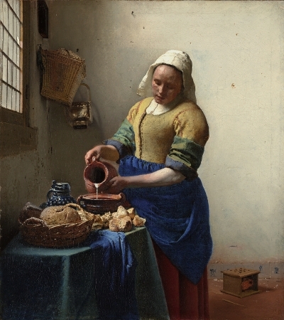
Left: Claude Monet, The Gare Saint-Lazare (or Interior View of the Gare Saint-Lazare, the Auteuil Line), 1877, oil on canvas, 75 x 104 cm (Musée d’Orsay)
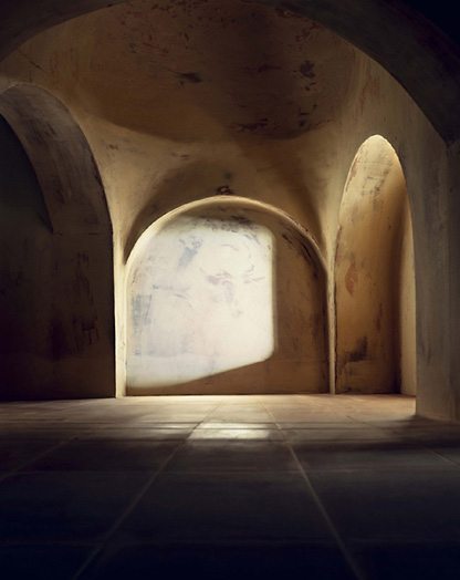
Right: Diller Scofidio and Renfro, Blur Building. Photography by Beat Widmer and Dirk Hebel.
When travelling I can't help but hold in one hand the place before me, and in the other, the image of something else I have seen somewhere else. I think of it as an act of pairing, this habit I make of attaching the unknown to a known. I think I established this habit, subconsciously, as a way to both generate meaning, and to locate myself.
In June of 2018, alone in London, I went a Monet exhibition at the National Gallery. The exhibition was entitled Monet and Architecture and so, these being two of the most personally-defining words in my life, I could not not go.
But, being present there, in London, with a selection of Monet paintings, beneath the ground in the National Gallery, hours passed and I was still trying to grasp it. I was alone and I was felt I was no-where.
The exhibition was supposed to be about architecture, but it was more about the dissolution or impression of architecture. So much so that there was almost no way of pairing the atmosphere and affect of it all. For a long time I struggled for reference points. There was no daylight in the gallery and I lost my feel for the hour.
Then, as other visitors moved around me, I stood still. I realised I was holding in one hand Monet, the train station, thick steam and early morning light, and in the other; Diller, Scofidio & Renfro, the still water of the Swiss lake, and just above it, the no-longer existing Blur building.
This is a pairing which is also an effect. This is how we make sense of things. We bring together the nearly understood, the blurs of human expression, and find through these connections a transcendent kind of clarity. Through these fragile impressions, we can connect worlds.